Hope that you like it, as I really enjoyed making it.
Cutout animation works by creating characters and sets using bits of paper cut into shapes, and moving them a little at a time before taking a photo, it's a similar process to frame by frame drawn animation, but instead of drawing it, you have the bits already cut out, and move them yourself, so it can be a little more complicated, you play back the individual frames at a fast speed so that it creates the illusion of movement.
Creating the animation
I started out by coming up with idea for an animation, after a while of thinking, I had decided to do an animation I had came up with quite a while ago, but instead to do it as a cutout animation, I did this because cutout was the best way to make this kind of animation I felt, stop motion with clay though doable would not have been as practical, though it would have been cool to try I decided to go with the more practical option, and I was not allowed to animate on the computer, so cutout was the best choice, I often come up with videos to go with the music I listen to, it often just happens as I blank out and start to day dream while listening to music, so in a way I already had the idea before we even started.
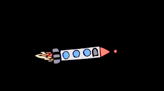
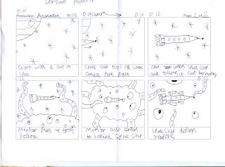
After this I created a story board, I had tried to mark at the top of the slides the timing I would need to properly animate the video, setting the start and stop times of each slide, sadly this did not work out as I needed to cut my animation down to 30 seconds, rather than the full minute due to constraints, after this I went to a craft shop and purchased some quality paper, thicker than usual paper so it would not be as likely to crease and fall apart in my hands as I am somewhat heavy handed, before creating them though I came up with a few ideas for different space ships and monsters, in the end I went with the more basic but visually pleasing space ship, I felt it worked well as it was easy to move around, and was a practical shape.
For the monster I got a bit more ambitious, I took inspiration from the Futurama monster from the episode "The beast will a billion backs" as it is a planet sized cloud monter with huge pink coloured tentacles, when creating the monster however, I found I did not get enough paper, so I had to down size my monster, originally I had planned for the monster to be far to big to fit onto the screen, and even serve as the background at one point as evident in my story board, but instead I down sized it and made it just a little smaller than the screen, though it never fully comes into view.
While animating I had to tape a camera to the top of the mac screen to get enough hight from the table, I used iStopMotion 3 to create the animation, it took about 3 lessons to fully animate my video, as well as editing in the lazer shots from the spaceship using Adobe After Effects, to put in the music soundtrack I used garageband and to put in the titles and credits I used iMovie, then exporting it into an MP4 file format.


i really enjoyed watching this although you could have had more suspenceing music to go with the fight scene.
ReplyDeleteat the end you could have had more explosion and for us to see what the finished produce was of the monster.
over all enjoyable to watch
I think this was brilliant considering it is very hard to move cut outs when filming, the sound works well and the action keeps it interesting. I liked how the 'FIGHT' switched from black to white, and worked well with your animation, also good ending. Well done Denham!
ReplyDeleteBrilliant animation Denham, really well done! The only thing I would improve on would be the lighting in places, but there wasn't much you could do about that with the rooms that we were in. Other than that, everything else was amazing! Also on the FIGHT! Scene I think that the gun could have come out a little bit slower by using more frames. Other than that I loved it.
ReplyDeleteI liked your animation, it moved very smoothly. I was shocked at how well you managed to move the pieces of paper as I have found it very difficult to move the cutouts very well. I also liked how the music was lined up with the animation e.g. The song said fight just and so did the words on the screen.
ReplyDeleteDenham what to say about this video it was really good the sound effects were really throughout the whole animation at the end of the animation you could have had a bit more explosion towards the end showing that it finished overall very good
ReplyDeleteLOVE YAA Denham BABE
The animation was great and i like the music and the way you have the sound fight go with the animation and that music goes well also i like how smooth it was.
ReplyDeleteDenham, i LOVED your animation, it was fun, creative and alot of effort was put into it. The only criticism i could give was the light changed alot throughout your video. overall i enjoyed your video!!
ReplyDelete